
Hi All! Please send me an email (blujay@westnet.com.au) or comment below if anything in the following post doesn't make sense or you would like some further explanation. I'm happy to help!
PS: I don't profess to be an expert at product photography, or think that I have the best photos on Etsy. What I do know is that my photos look nice, but can always be improved!
Correcting Colour Curves
Are your photos dull, underexposed (not bright enough) or overexposed (too bright)? If so, there is a quick way of improving lighting and tonality of images within editing software. Today i'll be going through the process in GIMP, but there should be a colour curves option within all photo editing software. Correcting the colour curves is one of the most sophicated tools you can use, but don't be scared, it is remarkable easy to use!
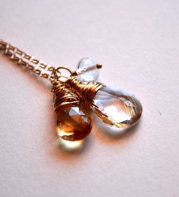
A colour curve is a graph of the tonality of an image, or put more simply, it represents the range of the light and dark pixels. Below, I've put a photo and it's colour curve side by side. As the lighting at the time the photo was taken wasn't too great, even though the necklace was on a white background the tones are predominantly grey. This is represented in the dialog box by the histogram peak being over the grey part of the gradient on the x axis. Although you can edit all the channels in an image (Red, Green Blue) i'll be focusing on the black/white channel that will brighten the image.


The colour curves dialog box can be accessed by selecting the 'Colours' menu on the top title bar and then clicking 'Curves'.
In the example above, in order to change the brightness of the image, I'll need to alter the histogram so the peak of the pixels are more within the right side, or bright side, of the graph. To do this, I drag the circle anchor in the top right hand corner along the top of the box until it is about even with where the histogram starts to increase (see below). As you change the settings within the dialog box, your image should preview the changes, so you can see if you need to increase or decrease brightness.


Contrast
The output from my colour curve editing looks pretty good so far, but products can really pop if you play around with contrast. Contrast is the difference between the light and dark tones within an image. A image with high contrast will have areas of extreme brightness (white) and areas of extreme dark (black) adjacent to each other. The aim of adjusting contrast is to make a subtle difference in the look of your item and to hopefully make it 'pop' away from the background.
The contrast menu can be accessed by clicking Colours > Brightness and Contrast. Within this dialog box, the only thing you need to worry about is the contrast slider – slide to the right to increase contrast, and to the left to decrease contrast.

Notice the difference in the photo below to the one above with the colour curves altered. The image appears crisper and clearer, all from changing one little slider!
Experimentation – Live a Little!
I would not have learned what I have just showed you if I had not sat down and had a play with my first lot of product photography for a few hours. Have a play with the colour curves, use different channels, change the contrast etc - It is worth the time and effort to learn how to improve!
Next Post
Notice how the image above has orange/red shadows? Do your items have one colour predominately featuring due to poor lighting or incorrect whitebalance? In the next post I will show you how to change the colour balance and colour saturation of your images to better show their true colours.
I love photo improvement tutorials!
ReplyDeleteThanks.
No worries! Hope it was helpful! :)
ReplyDeleteThank you so much for sharing your expertise! Your newest follower from EBT, welcome.
ReplyDeleteGreat tips, thanks!
ReplyDeleteThank you for this! I've tried to play with curves before but never really understood it or what I was doing. This simple explanation was so helpful :).
ReplyDeleteI never understood curves before. Thanks!
ReplyDeleteThank you, very informative!
ReplyDeleteThanks for that post! GIMP isn't the easiest program to use so it's good to have some instructions.
ReplyDeleteWow, I guess I've been doing it wrong. I usually grab the line where it intersects the spike and drag it up towards the peak. I didn't even notice the grayscale along the side!
ReplyDeleteI just tried that method, and it basically does the same thing, just with a curved line instead of a straight one. You can also change the curve type that you use, so instead of a straight line (smooth) it can be drawn on (freehand) for real precision.
ReplyDeleteI don't think there is anyway of 'doing it wrong' - I think it all comes down to what works best for your images. :)
awesome tutorial - cheers!
ReplyDelete