
Tuesday, 29 March 2011
Monday, 28 March 2011
Part 4 - Improving your photos with GIMP - Resizing, Cropping and Recap!
Recap
As this is the last in my series on improving photography, I thought I would do a quick recap before heading into the last part.
In the first post I highlighted some of the basics of setting up your photography:
- Use a complimentary background. Not too busy, not too bright, but just right!
- Take your photos in natural light (diffuse is best or use a light box)
- Model your items. What does it look like on a person? What can I use this item for? What does it look like framed?
In the second post I showed you how to alter colour curves and get rid of grey in your images. The important message to take away from this post is to experiment! Play around with the histogram and see what works best for your items. I learned from a comment on my post that you can curve the line by grabbing it anywhere and I now use this method for my photos.
In the third post I showed you how to alter the colour balance and saturation of images to correct any lighting mistakes during shooting. Important things to remember are:
- Subtle changes can make big differences.
- A bit of work setting up good lighting and checking your camera settings can save alot of time during editing!
- Experiment!
Resizing and Cropping
In today's post I will be showing you how to crop and resize your image. I have gone a bit back to front in this post as I probably should have posted about cropping right at the start as this is normally the first thing I do when editing my photos. It is important to get the image that you would like to display correct before fiddling with colour curves etc as the colours present in an unfinished/uncropped image may detract from the look you are trying to achieve.
In today's post I will be showing you how to crop and resize your image. I have gone a bit back to front in this post as I probably should have posted about cropping right at the start as this is normally the first thing I do when editing my photos. It is important to get the image that you would like to display correct before fiddling with colour curves etc as the colours present in an unfinished/uncropped image may detract from the look you are trying to achieve.
Cropping photos is pretty important, especially online somewhere like Etsy or Artfire where the first impression of an item is made from a small thumbnail that needs to grab a buyers attention. I normally try to show a relative close up of the detail of my items (eg, the pendant on necklaces) or sometimes the whole item (earrings) if they are small/eyecatching enough to be shown in the thumbnail. I love the way andiespecialtysweets chooses to showcase her items with clever and subtle cropping.
 | |||||
| Peppermint Candy Buttons by andiespecialtysweets |
The cropping tool is found on the main toolbar within GIMP and looks like scalpel. To crop, drag a box around the section of your image you would like to keep and then double click. If you aren't happy with your first attempt, before double clicking, you can resize the crop selection by moving the squares in the corners.

Resizing
Resizing is especially important for the first image that you will be showcasing for your item. Make sure that the most eyecatching part of your item is visible (this is part cropping and part resizing). I normally use a 400-600 pixels width/height for my items as I find this creates a good size, without making a huge picture that takes up all the screen! It has taken me a little bit to find out what ratio works best for my images, and I still have a few gigantor pics in there but I am slowly weeding them out.
To resize in GIMP, select Image > Scale Image from the menu. You can select whether to resize in pixels, cms, inches, etc. I use pixels as this is normally what dimensions are refered to online.
The End... Or is it...?
I have really enjoyed sharing my growing knowledge with you all through this series and I hope that is was of some use! Sadly this is the last scheduled post on improving photos, but if there is anything I haven't covered that you would like shown in more detail, please let me know!
Next week - Inside My 'Studio'
Next week - Inside My 'Studio'
Wednesday, 23 March 2011
How Much Are You Willing to Pay for a Pet?

I love my two kittehs and the other pets that I have lived with over the years. My two fuzzy friends at the moment were both purchased, Luna (tabby in foreground) from the local pet store and Eski from a out of state breeder (she's a bengal). The amount of money I spent aquiring them does not have any bearing on how much they mean to me. Granted, I did pay what some people would say was an excessive amount for Eski - just over $1K (AUS) but I thought that the story of a anonymous buyer paying 1.5 MILLION DOLLARS for a dog was a little more excessive. If I spent 1.5 big ones on a pet I would definately be getting pet insurance...
The breed is a Tibetan Mastiff - males can grow to 33 inches or 80+cm at the 'withers' (shoulders) and the heaviest on record was 130kgs (typical weights are between 70-80kgs). I love this quote on wikipedia:
'As a socialized, more domestic dog, it can thrive in a spacious, fenced yard with a canine companion, but it is generally not an appropriate dog for apartment living.'
Who would have thought?
 |
| Tibetan Mastiff - Cross between a dog and ALF |
Sunday, 20 March 2011
Part 3 - Improving your photos with GIMP - Colour Balance and Saturation
PS: I am still learning about GIMP (just like you!) so I don't profess to know everything. If i make a mistake, or you have a better way of doing things, please leave a comment below! I love to learn to make my photography better.
Today's post is long enough to be two separate posts (sorry about that!) but I thought I should keep colour balance and saturation together as they tend to go hand in hand. Last post I explained colour curves and showed you how to eliminate greys and brighten your images. The aim of today's post will be to correct colour balances in images.
Colour Balance
The reason why we correct the colour balance is because the way our camera detected the white (or highlights) in our image was incorrect. This is called 'white balance' on a camera and 'colour balance' when you adjust it in post production. Most point and shoot cameras have inbuilt preset white balance settings which can be changed (cloudy, incandenscent, direct light etc) through the setting menu and all DSLRs have a manual setting in which you can change the white balance as well as presets (the top of the range pro cameras can be purely manual as well with no presets - $10K+ (!)).
Basically the different settings compensate for the 'type' of light that you set and adjust the colour temperature to make sure that what is white in a scene is recorded as white by adjusting the relative proportions of the primary colours, red green and blue. For example, the incandescent setting adjusts and produces a colour temperature that is more 'cool' or blue than say, the cloudy setting, which produces a warmer colour temperature. There are many indepth reviews and guides about colour/white balance in photography magazines and online - I have put a few links up to good guides in my 'Links' page.
Basically the different settings compensate for the 'type' of light that you set and adjust the colour temperature to make sure that what is white in a scene is recorded as white by adjusting the relative proportions of the primary colours, red green and blue. For example, the incandescent setting adjusts and produces a colour temperature that is more 'cool' or blue than say, the cloudy setting, which produces a warmer colour temperature. There are many indepth reviews and guides about colour/white balance in photography magazines and online - I have put a few links up to good guides in my 'Links' page.
So now you have an understanding of what's going on we can now learn how to correct imbalances in your images! I've put an example of one of my photos below which has been taken indoors with the wrong white balance setting. It is way too blue - my mannekin's skin tone looks like an alien/zombie hybrid! Let's make her a bit more human looking :)

Within GIMP, the colour balance dialog can be found in the 'Colours' menu under (strangely) 'Colour Balance'. A dialog box like the one below should pop up.

When I am editing colour balance, I don't tend to change the range for adjusting from the midtones. I find this gives me the best image, but depending on the image, you might find the other ranges need adjusting too. Experiment with what works best for you.
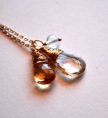
So, in my recycled glass necklace photo, I can see that the colour temperature at the moment is quite cool and blue. I can correct this by moving the sliders down the bottom of the dialog box more to the warmer ends - yellow and red. Red gives the skin tone a pink flush and yellow also adds warmth. I need to be careful not to overdo it though, or my photo can come out looking worse than it came in! Below are the results of tweaking the colour balance and the final positions of the sliders in the dialog box. She looks more like a vampire now - still a bit pale! :)
So, in my recycled glass necklace photo, I can see that the colour temperature at the moment is quite cool and blue. I can correct this by moving the sliders down the bottom of the dialog box more to the warmer ends - yellow and red. Red gives the skin tone a pink flush and yellow also adds warmth. I need to be careful not to overdo it though, or my photo can come out looking worse than it came in! Below are the results of tweaking the colour balance and the final positions of the sliders in the dialog box. She looks more like a vampire now - still a bit pale! :)


Saturation
Saturation is what is sounds like - how intense a colour is. Think of it in terms of being misted with water (unsaturated) to jumping in a swimming pool (saturated). Sometimes, changing the colour balance doesn't cut it with correcting colour imbalances as sometimes one colour is way too dominant compared to others, or colours that are suppposed to be bright have somehow come out dull. In the image below, it too is quite blue, like the example above, and the yellow/gold tones have been washed out.

Saturation can be changed in GIMP from the Colours > Hue - Saturation dialog box. It should look like the below. When you first open the dialog box it will have the 'master' setting selected - any changes to saturation, hue or lightness will affect all colours within the image.

I completely desaturated this below image, effectively turning it into a grayscale image by sliding the saturation slider all the way to the left. When you do this, you will notice that all of the colour boxes gradually more grey, until they are all completely grey.

To alter different colours, click the circle 'checkbox' next to it. Then use the slider to change the saturation of each individual colour. Below is the example above after having the blue and cyan channels desaturated to some degree and the red and yellow channels saturated. You can see from the dialog box below that the blue channel has been completely desaturated (grey) and the cyan channel is also slightly grey.


HINT - If you change something you didn't want or make a mistake in any of the dialog boxes, pressing the 'reset' button on the bottom will reset the image back to what it was when the dialog box was opened - very useful feature!!
Next Post
I hop you found this tutorial helpful and please comment below if you want any clarification or if I have made a mistake! Next week, it's the last in the series and i'll be talking about cropping and resizing images specifically to make them great for viewing on Etsy.
Also, please let me know if you would like a specific tutorial on something that you would like covered (filters, working with layers, creating banners, avatars etc). I'll be happy to help!

Thursday, 17 March 2011
You May Now Have an Excuse Not to Eat Your Greens...
Have you ever wondered why some people love certain foods? I have always been flabbergasted by people who don't like chocolate - how can that be?! I recently listened to a podcast from All in the Mind on ABC's (Australia) Radio National about Supertasters which provides some answers to these important questions and also raises some important health implications.
Supertasters are basically people with more taste buds - the most in fact! More taste buds allow them to taste more intensely, for example, bitter is extremely bitter and repulsive. On the other end of the spectrum is a Non Taster. They find what a Supertaster tasted as extremely bitter (or sweet etc) as having no taste at all.
So why have we evolved to have some people with Supertasting powers and others not so much? Researchers believe that it has something to do with poisons and being able to detect them even at low concentrations - a supertaster has an advantage here as bitter poisons are much more replusive and less likely to be eaten. However, in different environments where there are bitter plants that are safe to eat, the Supertaster would be at a disadvantage.
The realm of taste also has implications on health. Linda Bartochuk, the physcologist studying this explains it well:
'That neon taste world of the supertaster includes not just taste, sweet, salty, sour, bitter, it includes perception of fat because that's perceived by touch fibres and those fungiform papillae that supertasters have more of have touch fibres in them. It also means that a supertaster feels more pain on the tongue and more burn from irritants...
So now you're living in a world where every food you pick up is way more intense to a supertaster than to a non taster. What does that do? Well the first few things are obvious: we don't like bitter, supertasters find bitter foods particularly difficult. Alcohol has a bitter taste to supertasters this gets us into the area of drinking. Tobacco smoke is irritating to the tongues of supertasters, it gets you into smoking. Well when you've got dietary preference drinking and smoking all related to a very small number of genes, you are explaining a lot of the behaviour that has health implications.'
However, super tasters are also less likely to eat their vegies, so there is an increased risk of cancers of the gut, such as colon cancer. Makes you think differently about the humble brussel sprout, doesn't it?
Listen to the podcast at the All in the Mind website.
Tuesday, 15 March 2011
Treasury Tuesday
My best treasury from the last week - Unteal We Meet Again. Peacock Teal is such a striking colour I wanted to showcase it with awesome Etsy items!
Sunday, 13 March 2011
Part 2 - Improving your photos with GIMP - Colour Curves and Contrast
Hi All! Please send me an email (blujay@westnet.com.au) or comment below if anything in the following post doesn't make sense or you would like some further explanation. I'm happy to help!
PS: I don't profess to be an expert at product photography, or think that I have the best photos on Etsy. What I do know is that my photos look nice, but can always be improved!
Correcting Colour Curves
Are your photos dull, underexposed (not bright enough) or overexposed (too bright)? If so, there is a quick way of improving lighting and tonality of images within editing software. Today i'll be going through the process in GIMP, but there should be a colour curves option within all photo editing software. Correcting the colour curves is one of the most sophicated tools you can use, but don't be scared, it is remarkable easy to use!
A colour curve is a graph of the tonality of an image, or put more simply, it represents the range of the light and dark pixels. Below, I've put a photo and it's colour curve side by side. As the lighting at the time the photo was taken wasn't too great, even though the necklace was on a white background the tones are predominantly grey. This is represented in the dialog box by the histogram peak being over the grey part of the gradient on the x axis. Although you can edit all the channels in an image (Red, Green Blue) i'll be focusing on the black/white channel that will brighten the image.


The colour curves dialog box can be accessed by selecting the 'Colours' menu on the top title bar and then clicking 'Curves'.
In the example above, in order to change the brightness of the image, I'll need to alter the histogram so the peak of the pixels are more within the right side, or bright side, of the graph. To do this, I drag the circle anchor in the top right hand corner along the top of the box until it is about even with where the histogram starts to increase (see below). As you change the settings within the dialog box, your image should preview the changes, so you can see if you need to increase or decrease brightness.


Contrast
The output from my colour curve editing looks pretty good so far, but products can really pop if you play around with contrast. Contrast is the difference between the light and dark tones within an image. A image with high contrast will have areas of extreme brightness (white) and areas of extreme dark (black) adjacent to each other. The aim of adjusting contrast is to make a subtle difference in the look of your item and to hopefully make it 'pop' away from the background.
The contrast menu can be accessed by clicking Colours > Brightness and Contrast. Within this dialog box, the only thing you need to worry about is the contrast slider – slide to the right to increase contrast, and to the left to decrease contrast.

Notice the difference in the photo below to the one above with the colour curves altered. The image appears crisper and clearer, all from changing one little slider!
Experimentation – Live a Little!
I would not have learned what I have just showed you if I had not sat down and had a play with my first lot of product photography for a few hours. Have a play with the colour curves, use different channels, change the contrast etc - It is worth the time and effort to learn how to improve!
Next Post
Notice how the image above has orange/red shadows? Do your items have one colour predominately featuring due to poor lighting or incorrect whitebalance? In the next post I will show you how to change the colour balance and colour saturation of your images to better show their true colours.
Tuesday, 8 March 2011
Monday, 7 March 2011
Part 1 - Improving your photos on Etsy with the basics and GIMP
We have all heard it 5 bajillion times - great photos are the cornerstone to selling online. Buyers can't pick up, feel, see and try on your item, so you need to showcase the item to it's best ability in your listing. However, there are many sellers out there that think that producing great photos is too complicated, you need a fancy camera, it takes too long yada yada yada, and leave improving their photos on the back burner.
It is for this reason that over the couple of weeks, I will be outlining a few simple techiques that can be used to enhance you photos, including post production techniques within GIMP that don't take forever and are relatively simple to use. I am by no means an expert at this, yet I have learned to improve what I thought were pretty good photos into excellent ones using these techniques. I plan for this series to run over 2-3 weeks:
- Etsy Photography Basics
- Correcting Colour Curves
- Contrast
- Colour Balance/Saturation
- Resizing and Cropping
Composing Your Shot - Backgrounds
It's true that getting the hang of composing your shots can take practise. Etsy has a unique aesthetic and it is for this reason that it is important that you experiment with what showcases your items the best.
I like to use a background that creates a moody atmosphere to my shots - you may be surprised to find out that I use the underside of a wooden trinket box! Have a play around with different textures and colours to find what works for you. White is a popular choice, and many sellers have suggested that you are more likely to be featured on the front page with a white background (I have my reservations on this one). I would advise against 'busy' backgrounds (crazy patterns etc) as they tend to make your item become lost and can overwhelm buyers.
TwoSugarBabies is a great example of a seller that uses coloured backgrounds and subtle patterns to great effect to make their cute fondant cupcake toppers pop!
Lighting – The Sun is Your Friend!
One of the most important aspects of photography is lighting. I always take my photos in the morning sun to take advantage of the soft light. Afternoon light where I live is way too harsh for my style of shot – but again, have a play around with what works best for you. The best way to do this is to set up near a open window or glass door to be able to get the most amount of light possible.
One thing I can't recommend more is to TURN OFF YOUR FLASH. Your flash is not your friend. Unless you are a professional with bounce flashes and other fancy equipment, direct flash photography is too harsh and does not impart the true look/colours of your item. I much prefer to wait until I can get decent natural light or play with the lighting in post production.
dearjes has great photos with lovely natural light (be in sunlight or a sunlight lightbulb). The soft natural lighting that they use helps create a cohesive theme in their shop.
'Modelling' Your Items
Studio Revamp Scenario: I am looking for a print for my studio (more blog posts on revamping my studio/spare room soon!). There are many many prints for sale on etsy and I am tossing up between two awesome prints:
- One only has a scan of the print.
- The other has the print scanned in, framed and also a shot of it placed in a room to show what it may look like when displayed. From this I can tell roughly how big it will be when put in my studio and what it might look like.
From the example above, you can see that modelling or displaying items is another very important aspect of online selling. Modelling shows the buyer what your item looks like on someone, how big is it, where could/would they display it, what are it's possible uses, etc.
I currently sell jewellery and there is a bit of contention over whether earrings and, to some extent necklaces, should be modelled on a live person due to hygiene issues. There are buyers that would prefer to see the earrings on a real person and others that don't so you can't win either way. I choose not to use a live model, but instead to show the dangle of earrings from a surface that they can, well, dangle from. I use a plastic torso to model my necklaces.
Remember that the same principles apply for backgrounds apply when modelling items, try to get a background that allows you item to 'pop'.
Grayworksdesign displays their gorgeous cutting boards with simple props that show the buyer what the items can be used for which includes uses that you wouldn't think of straight away!
'Bad' Camera – Not an excuse!
I am lucky enough to shoot my products using a Nikon D90, and I think that this does make my life easier during post production. However, I also have a Sony Cybershot point and shoot camera that takes remarkably good photos. Work with what you have and can afford, use natural light and you will be surprised at what you can achieve.
Remember, even if your camera takes less than impressive photos, a myriad of sins can be corrected in wonderful programs such as GIMP. Stay tuned for my next post where I will delve into correcting colour curves and explain how to make your photos brighter in the process.
Subscribe to:
Posts (Atom)